Articles Article
How we turned our Blutui UI into interactive cutouts for the new website
How we turned real Blutui screens into interactive HTML and CSS cutouts for our new website, using Claude, container queries and a sandbox site to build them faster than images or video.
3 min read
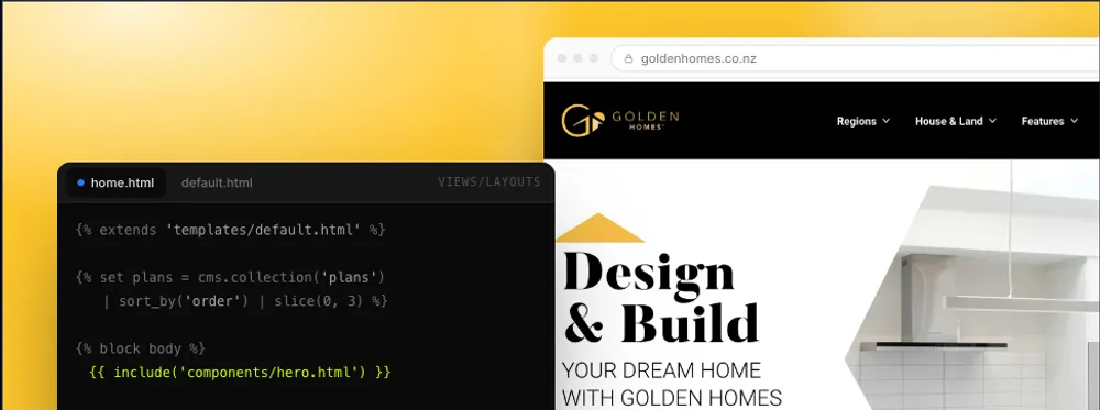
A few weeks ago we started rebuilding the Blutui website. The old site wasn't telling the right story. We're proud of the product, and the site wasn't showing enough of it. So a big part of the redesign came down to one question: how do we actually show off the Blutui UX and UI?
Starting with a screenshot (and getting it wrong)
My first idea was to turn pieces of the Blutui interface into small interactive chunks of HTML and CSS. To test it, I gave Claude a screenshot and asked it to rebuild it. The results weren't great. Early versions looked nothing like the UI I'd given it, and every one of them needed a lot of tweaking.
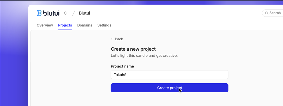
So I worked backwards. I'd already built a tool that makes visual representations of UI, so I tried that instead. It produces a much simpler version: just lines and text on a solid background, like the examples below.
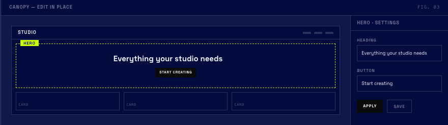
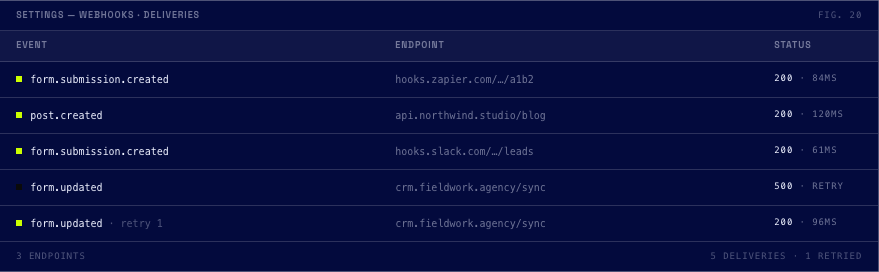
They looked distinctive, but on a site that's already dark navy they would have felt flat.
A quick detour: our sandbox site
Before building any of these visuals into the real site, we wanted to see how they'd look. So we made our own sandbox site, which became the staging ground for every bit of UI that ended up on the new website.
It let us keep iterating on the visuals while we were still finishing the copy. It also gave the team one place to look at everything and give feedback, which we really needed.
You can take a look here: https://visual_test.blutui.com/
Building the cutouts
We wanted to turn nearly every important screen in Blutui into a cutout. I started with the most basic screen, one where the background could stay the same while different content swapped in and out. That became the base. The fine-tuning was mostly padding and positioning. Once that was right, I had a background I was happy with for the Console UI. From there, each version only had to change the highlighted tab and update the content inside it.
I used Claude to iterate the whole way through, and as we went I had it write down the rules it was following. Once one or two cutouts were in a good place, I could give it those as references along with a screenshot, and the conversions came out close to one-to-one. The first couple took a few hours each, most of that time was spent fine tuning them. Later ones took only a few minutes each, because Claude had better references to work from and each new cutout needed fewer fixes.
I followed the same steps for the rest of the UI, from the Console to the dashboard. That's how we made every cutout you see across the site.
Each cutout is its own canvas file, which is simply an HTML file with Blutui Canvas code in it. Some also have custom CSS animations that loop. Adding a new one to the site is as simple as dropping the file into a folder.
Using the cutouts during design
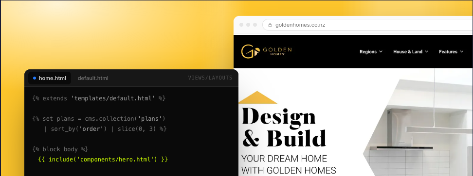
We also used the cutouts while we were designing the site. In the visual tool we could adjust them while the pages were still being designed, then use them as screenshots and placeholders in our designs. That meant we didn't have to rebuild the UI in Figma.
The cutouts use container queries, so the same one fits well in lots of different shapes and sizes. When we moved them over to the main site, the only things we had to tweak were the sizing and the text content.
Why build them in code?
A static image only shows one moment. Building the cutouts in code means people can interact with them, so they see how Blutui works instead of only reading about it.
We also thought about using video, but we wanted several of these on the same page. You can optimise video, but once the cutouts were built and we compared the two, the code versions kept the page faster and lighter. They're also interactive, which a video cannot be.
Wrapping up
It started with a screenshot and a pretty rough first attempt from Claude. It ended with a set of cutouts that run across the whole site. Most of the effort went into the first one or two: getting the base right, and having Claude write down the rules as we went. Once those were in place, the rest came together much faster.
The sandbox site helped a lot too. Having all the cutouts in one place made it easier to iterate and get feedback from the team before anything went live.
If you haven't seen the new site yet, have a look and try clicking through the cutouts.
More Articles
-
8 min read
Don't Let Your Web Builder Become Your AI LandlordAI freedom and cost control: What happens when tokens spiral?
-
8 min read
Ice Cold Cola WarsThe Coke, Pepsi and Agency Clusterf**k Nobody Can Get Back in the Studio Fridge
-

1 min read
Built by an agency, for agencies: see Blutui in actionWe took a prototype design and turned it into a working website, live. Here's the full recording.
-

2 min read
Lions Beats the Booze Ban by the Skin of Its Rosé-Stained LipsThere are close calls, and then there is whatever happened on the French Riviera this week.